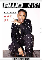
RWD is a British based Hip- Hop, Grime and Rnb Magazine that includes some Fashion and sport. RWD is an online only magazine that is found because it is online it does not follow some of the main conventions that magazines follow such as barcode and prices that a normal physical copy of a magazine would have.
RWD is a grand example of an Ezine. An Ezene are different from magazine websites, the layout for this Ezine id very similar to hard physical copy of a magazine
Front Cover
The image of the magazine is a close up. 'Big Sean' is wearing a matching tracksuit and a chain, he looks clean and fresh. The way he is presented is in the form as someone wealthy and confident because of the way he is posing. As for his facial expressions he looks very serious, this is the way many artists of his genre present themselves. He has a lot jewellery on, this connotes prosperity and wealth. The colour of his clothing matches the colour scheme for the front cover, this makes the cover looked uniformed and simple.The background for the magazine is plain off tone of white, this makes the readers attention draw straight to him. The masthead is uncovered and nothing is in its way, perhaps this is because this magazine needs exposure as it is not as popular as XXL. The positioning for the masthead is on the top left corner on the page because it is usual to read left right and top to bottom. There is nothing else in the background this could suggest that he is very successful as he doesn't need nothing else to improve his image. The mast head font connotes something flashy because it is in italics.
There is only one cover line for this front cover as it is an online magazine. A regular magazine uses its cover lines to attract readers and their audience and online magazine does not have to do this therefore it only uses this one cover line to show what the front cover is about and the main element to the magazine. Overall the front cover is very plain and simple as the writing is very limited and the colours are plain.
Mast Head - Font=Modern
Cover line- Big Sean in a simple font. There is only one cover line as the front cover is not going to be in a shop trying to attract the reader by what it says on the front cover. This the reason
why this front cover is very plain and simple.
Image- Long shot- not like regular magazines.
 Contents Page
The image for the contents page is placed across the whole page but it is not seen entirely, there is a text box with the actual contents that covers the picture. This could be because the whole image does not have much importance but it also makes the page look a bit intricate. What we see in the image is a male model that looks young (around 16-17) and stylish. He is wearing casual in-style clothing. The bomber jacket and trainers that he is wearing connotes young, trendy. This could mean that as a young person he is following the latest fashion trends. This is an image of what many your people would wish to have in terms of clothing.
As this magazine is not only music based the fashion side is portrayed throughout this image, furthermore we see that this is a big element because it is a part of a section in the contents calles style. There are headings for each section that are in red, this colour matches the T-shirt that the model is wearing but it also following the colour scheme for the front cover. The text that is place in between each section is in black and it does not include any explanation as to what is to be expected, like the XXL magazine. There page numbers for each section which are useful for the quick navigation of the online magazine.
- The contents page does follow up with normal code and conventions. It has heading editorial contents and the layout is the same as normal contents pages. The image is the same as

Double Page Spread
The double page spread has a large medium shot that is spread out from the left page to right which is what a lot of hard copy magazines do. This gives this online magazine a realistic feel to it because it look as if your are looking at both pages from the magazine. In the image the artist form the front 'Big Sean' is seen again in the same clothing which connote wealthiness. 'Big Sean' is seen posing with his arm at the back of his neck which connotes a sense of vulnerability or shyness.The heading for this double page spread is bold and underlined, there isnt anything exciting with this heading but it is plain and straight to the point. There is a big paragraph under the subheading 'THE PURSUIT OF HAPPINESS'. The text is talking about a more deep topic that is why he looks a lot more vulnerable in the image, he is letting the reader know him in a different light.
 the Double Page spread has a large image the crosses over the right page which is what a lot of hard copy magazines do. There is two columns of writing.
- interview
Font is simple and modern
Wearing the same thing as the front cover
- Branded tracksuit 'cool'
- Gold Chains- riches

A detailed and well written analysis and you are starting to apply media terminology correctly, drawing on a range of examples. You are a little general on the language used in the DPS. Vanessa
ReplyDelete